
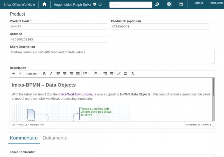
Custom Forms
With Imixs-Office-Workflow you can create forms completely model-based. No programming knowledge in HTML or Java Script is required. The custom form component enables you to design your forms at runtime. The definition of a custom form is done within the Imixs-BPMN modeler. To activate this feature you need to add the from “custom” into the section “Application -> Input Form” of your task element.
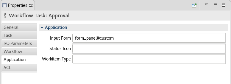
form_panel#custom
The definition of your custom form is defined by a “Data Object Element” with an association to your task element:
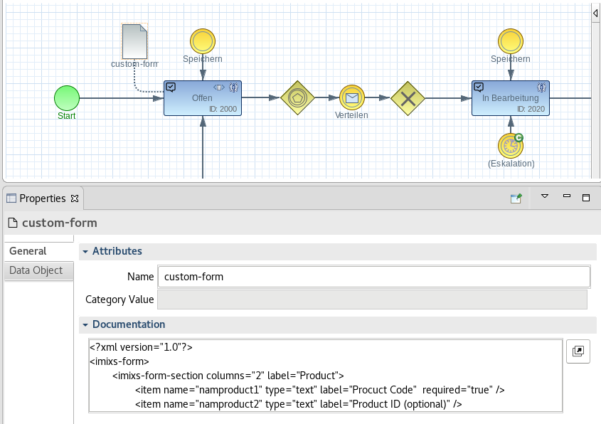
The Form Definition
The XML definition contains sections and items:
<?xml version="1.0"?>
<imixs-form>
  <imixs-form-section label="Controlling">
    <item name="description" type="textarea"
        label="Short Description" />
  </imixs-form-section>
  <imixs-form-section>
    <item name="details" type="html" label="Description" />
  </imixs-form-section>
</imixs-form>
The following common input formats are supported:
Text Input
<item name="description" type="text"
        label="Topic" />
Textarea Input
<item name="description" type="textarea"
        label="Description" />
HTML/RichText Input
<item name="description" type="html"
        label="Description" />
Date Input
<item name="invoice.date" type="date"
        label="Date" />
Select Boxes
You can also create different type of select boxes with predefined values:
 <item name="invoice.currency" type="selectOneMenu"
	label="Currency:"
	options="EUR;CHF;SEK;NOK;GBP;USD" />
You can choose one of the following types for select boxes:
- selectOneMenu - a dropdown menu
- selectBooleanCheckbox - a single checkbox
- selectManyCheckbox - a list of checkboxes (layout=line direction)
- selectOneRadio - radio buttons (layout=line direction)
selectManyCheckbox and selectOneRadio are displayed in line direction per default. If you want to display them in page direction use:
- selectManyCheckboxPageDirection - a list of checkboxes (layout=page direction)
- selectOneRadioPageDirection - radio buttons (layout=page direction)
Required Inputs
With the tag ‘required’ a mandatory input is defined:
<item name="_date" type="date" required="true"
        label="Date" />
Form Sections
A custom form is separated by sections. A section can have an optional label and up to 3 columns:
 ....
 <imixs-form-section label="Controlling" columns="2">
 	.....
 </imixs-form-section>
 ....
Custom Input Fields
It is also possible to define more complex input fields with the item type ‘custom’
<item name="mycustomitem" path="[PART_NAME]" type="custom" label="My Custom Label" required="true" readonly="false" />
Note: A custom item is defined by a JSF ui:composition placed in the directory /pages/workitems/parts/:
/pages/workitems/parts/[PART_NAME].xhtml
The mandatory path attribute contains the path for JSF component relative to the /pages/workitems/parts/ directory with the .xhtml extension. You can also use sub directories to group custom input items.
/pages/workitems/parts/[SUB_DIR]/[PART_NAME].xhtml
See the following example of a custom input field definition:
<ui:composition xmlns="http://www.w3.org/1999/xhtml"
	xmlns:ui="http://xmlns.jcp.org/jsf/facelets"
	xmlns:f="http://xmlns.jcp.org/jsf/core"
	xmlns:c="http://xmlns.jcp.org/jsp/jstl/core"
	xmlns:a="http://xmlns.jcp.org/jsf/passthrough"
	xmlns:h="http://xmlns.jcp.org/jsf/html">
	<span class="custom-class">
	   <h:inputText style="border:2px solid blue;"
	                value="#{workitem.item[item.name]}"
	                a:placeholder="enter custom data..."
	                rendered="#{!readonly}" />
	    <h:outputText style="border:2px solid blue;"
	                value="#{workitem.item[item.name]}"
	                rendered="#{readonly}" />
	</span>
</ui:composition>
Note: This custom input form uses also the attributes ‘readonly’ and ‘required’ to determine if the input component is editable or readonly.
Custom Input Section
As an alternative to the custom input fields you can also define custom sections. A custom section defines a complete form section and is used for more complex input forms including ajax.
<imixs-form-section label="My Custom section" path="sub_custom_form" >
Note: A custom section is defined by a JSF ui:composition placed in the directory:
/pages/workitems/forms/
See the following example of a custom input field definition:
<ui:composition xmlns="http://www.w3.org/1999/xhtml"
	xmlns:ui="http://xmlns.jcp.org/jsf/facelets"
	xmlns:f="http://xmlns.jcp.org/jsf/core"
	xmlns:c="http://xmlns.jcp.org/jsp/jstl/core"
	xmlns:h="http://xmlns.jcp.org/jsf/html"
	xmlns:i="http://xmlns.jcp.org/jsf/composite/imixs"
	xmlns:marty="http://xmlns.jcp.org/jsf/composite/marty">
	<!-- show outgoing references -->
	<div class="imixs-form-section">
		<dl>
			<dt class="imixs-no-print">
				<h:outputText value="#{message['form.reference.outgoing']}" />
			</dt>
			<dd>
				<marty:workitemLink workitem="#{workitem}" readonly="#{readonly}"
					filter="" />
			</dd>
		</dl>
	</div>
</ui:composition>
Note: Also in a custom section you can use the attribute ‘readonly’ to determine if the input components are editable or readonly.
Ajax Support
Within a custom form part or a custom section you can also trigger Ajax events refreshing other form parts or sections within the same form definition. For this behaviour you can refer to the clientId of the component ‘formComponents’. See the following example:
	<h:selectOneMenu
		required="#{empty required?false:required}"
		value="#{workflowController.workitem.item['space.ref']}">
			<f:selectItem itemLabel="a"></f:selectItem>
			<f:selectItem itemLabel="b"></f:selectItem>
			<f:selectItem itemLabel="c"></f:selectItem>

		<!-- trigger refresh over all components -->
		<f:ajax render="#{formComponents.clientId}"  />

	</h:selectOneMenu>
In this example choosing a new option from the select menu will refresh all other form components.
The customFormComponents
If you just want to update the elements of the custom form you can refere to the custom forms section by the binding customFormComponents
<h:selectOneMenu value="#{workitem.item['myselection']}">
		<f:selectItem itemLabel=""></f:selectItem>
		.....
		<f:ajax render="#{customFormComponents.clientId}"/>
</h:selectOneMenu>
This will trigger a render event only on the parts within the customForm Container