Documentation

Forms
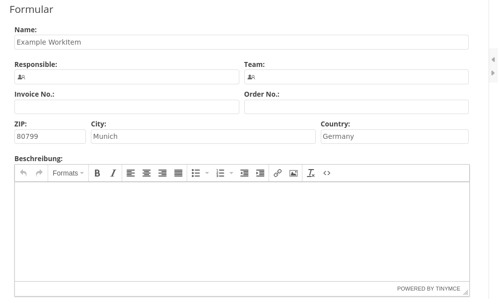
With Imixs-Office-Workflow you can create forms completely model-based. No programming knowledge in HTML or Java Script is required. Imixs-Office-Workflow implements the Imixs Form Specification a standard for describing business forms declaratively inside a BPMN model. Forms are defined directly in the BPMN modeler and rendered automatically at runtime.
The Concept
A form definition is stored as XML inside a BPMN Data Object and linked to a Task via a BPMN Association:
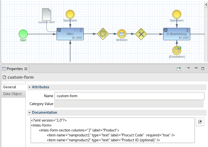
When a workflow instance reaches that task, Imixs-Office-Workflow reads the Data Object, parses the XML, and renders the form — dynamically, without redeployment.
A minimal form definition looks like this:
<?xml version="1.0"?>
<imixs-form>
  <imixs-form-section label="Order Details" columns="2">
    <item name="order.number" type="text"     label="Order Number:" />
    <item name="order.date"   type="date"     label="Order Date:" />
    <item name="order.notes"  type="textarea" label="Notes:" span="12" />
  </imixs-form-section>
</imixs-form>
Within an <imixs-form-section> you define input fields as <item> elements. Each item maps its value directly to the corresponding workitem:
<item name="customer.name" type="text" label="Name:" />
Each item has the following properties:
| Property | Type | Mandatory | Description |
|---|---|---|---|
name |
text | ✓ | Name of the item |
type |
text | ✓ | Item type (e.g. text, currency, date, …) |
label |
text | Optional label for the input field | |
required |
boolean | Marks the input field as mandatory | |
readonly |
boolean | Marks the input field as read-only |
Form Layout
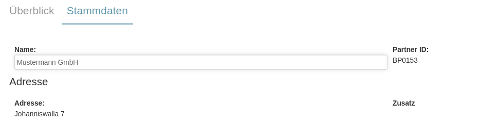
Each section uses a 12-column grid layout. Items within a section are arranged in rows according to their span values. The columns attribute provides a convenient shorthand for evenly distributing items. For example, columns="3" automatically splits the section into three equal columns, so every item takes up one third of the row. With the span setting in a item tag you can change the width of the item individually.
In this example the zip item takes only 2 grid columns, the city 6 and the country 4. It is important to ensure that a custom layout is always based on 12 columns:
For the full specification of the XML format, the 12-column grid layout, all standard input types, and default values, refer to the Imixs Form Specification on imixs.org.
Form Tabs
You can also define additional Tabs that group Sections horizontal. For this you define a tag named imixs-subform to separate a group of sections
<imixs-form>
  <imixs-subform label="Basic Information">
	<imixs-form-section label="Address:">
		<item name="debug.zip" type="text"  label="ZIP:" span="2" />
		<item name="debug.city" type="text"  label="City:" span="6" />
		<item name="debug.country" type="text"  label="Country:" span="4" />
	</imixs-form-section>
  </imixs-subform>
  <imixs-subform label="Advanced Information">
	 ...
  </imixs-subform>
</imixs-form>
Input Fields & Item Names
Even if you can define the item names of your input fields freely, it is recommended to use a consistent naming concept. This allows you to reuse code more easily and exchange data across your business process architecture.
For application-specific item names the dot.case format is recommended:
| Item | Type | Description |
|---|---|---|
| Order | ||
| order.name | text | Order name |
| order.number | text | Order number |
| order.delivery | date | Delivery date |
| Contract | ||
| contract.name | text | Contract name |
| contract.partner | text | Contract partner name |
| contract.number | text | Contract number |
| contract.start | date | Contract start date |
| contract.end | date | Contract end date |
| contract.fee | float | Contract fee per billing cycle |
| Creditor | ||
| cdtr.name | text | Creditor name |
| cdtr.iban | text | IBAN number |
| cdtr.bic | text | BIC number |
| Debitor | ||
| dbtr.name | text | Debitor name |
| dbtr.iban | text | IBAN number |
| dbtr.bic | text | BIC number |
| Invoice | ||
| invoice.number | text | Invoice number |
| invoice.date | date | Invoice date |
| invoice.total | float | Invoice total amount |
| invoice.vat | float | Invoice VAT |
| invoice.gross | float | Invoice gross amount |
| invoice.currency | text | Currency |
| Payment | ||
| payment.type | text | Credit card, SEPA |
| payment.date | date | Payment date |
| payment.amount | float | Payment amount |
| payment.currency | text | Currency |
| payment.cycle | text | Payment cycle (monthly, yearly, fixed date) |
Overriding the Default Form
In Imixs-Office-Workflow, the Forms Specification is active by default. As long as a task has a Data Object with a valid form definition associated, it will be rendered automatically. No additional configuration is required.
The Application → Input Form setting in the task properties is only relevant when you want to override this default behaviour — for example to load a completely custom, hand-crafted form instead. This can be useful for specialised use cases such as mobile applications or highly tailored UI layouts that go beyond what the form specification supports.

To disable the Forms Specification for a specific task and load a custom form instead, enter the name of your custom form template in the Application → Input Form field.
Imixs-Office-Workflow Form Components
Beyond the standard input types defined by the Imixs Form Specification, Imixs-Office-Workflow provides an extended set of form components tailored for enterprise use cases. These components follow the same XML syntax and integrate seamlessly with the standard form layout:
<imixs-form-section label="Payment">
  <item name="dbtr.iban" type="iban" label="IBAN:" span="8" />
  <item name="dbtr.bic"  type="bic"  label="BIC:"  span="4" />
</imixs-form-section>
The following sections describe all available components in detail:
- Input Parts — all standard and extended input types
- User Input — user and team selection fields
- Workitem Linking — linking related process instances
- Organization Uinits (Spaces) — advanced section layouts
- Country Codes — country selection
- Analytic Parts — charts and KPI widgets
- Validation — input validation rules
- Custom Parts — how to build your own components
- Autocomplete — autocomplete fields
- Date Converter — date format conversion
- Form Expressions — dynamic field visibility and values
- Dashboard — dashboard widgets